Designing advertisements for your Climate Resilience Group


Introduction
Advertising is a crucial tool for the successful launch and growth of your climate resilience group.
By effectively advertising your meetings, you not only raise awareness but also foster a larger, more diverse group of participants, which is essential for robust community engagement. The purpose of advertising is multifaceted. Primarily, it serves to inform the community about the existence of your group and its objectives. Clear and compelling advertising ensures that people understand not only when and where meetings will take place, but also what they can expect to gain from attending. This clarity helps in aligning the group's activities with the interests and needs of potential members, thereby increasing attendance and participation rates.Moreover, strategic advertising can also inspire a sense of urgency and importance surrounding climate issues. It encourages individuals who may feel isolated or overwhelmed by climate anxiety to join a supportive network where their feelings can be validated and transformed into action. By highlighting the impact of collective efforts, advertising can motivate community members to contribute to the success of your group.
Ultimately, effective advertising for your climate resilience group is about creating visibility and accessibility. It's about making sure that everyone in the community knows they have a platform to discuss climate issues, share their experiences, and collaborate on actions that make a real difference. With thoughtful and inclusive advertising strategies, your climate resilience group can become a powerful catalyst for change!
This guide provides templates for you to use in advertising your climate resilience group as well as resources for creating your own advertisements.
Designing Your Own Ads
-
Use Canva (https://www.canva.com/), an online graphic design platform with hundreds of pre-made templates for advertisements. Canva has a free option, plus subscription options that give you access to more designs and features.
Use Slidesgo (https://slidesgo.com/event), that provides free templates for powerpoint and google slides.
-
"Transform Anxiety into Action – Unite for Climate Resilience!"
"Together, We Can Heal – Join Our Climate Resilience Community."
"Empower Your Climate Journey – Be Part of the Solution."
"Feel Overwhelmed by Climate News? Find Support with Us."
"Building a Sustainable Tomorrow, Together – Get Involved!"
"Connect, Share, and Grow in Our Climate Resilience Group."
"Harness the Power of Community for Climate Action – Join Today!"
"Your Feelings Matter – Address Climate Concerns Collectively."
"Navigate Climate Emotions with Support – We’re Here for You."
"Build a Resilient Future – Start with Our Community."
"Voice Your Climate Hopes and Fears – Find Strength in Numbers."
-
Instagram
4:5 Ratio (1080 x 1350 px)
1:1 Ratio (1080 x 1080 px)
1.91:1 Ratio (1080 x 608 px)
Instagram Reels
9:16 (1080 x 1920 px)
Facebook Posts and Timeline photos
1.91:1 Ratio (1200 x 630 px)
Facebook Cover Photos
Desktop Display - 2.6:1 Ratio (820 x 315 px)
Mobile Display - 16:9 Ratio (640 x 360 px)
Linkedin
Landscape - 1.91:1 (1200 x 627 px)
Square - 1:1 Ratio (1080 x 1080 px)
Cover Photo - (1128 x 191 px)
X (Formerly Twitter)
Square - 1:1 (400 x 400 px)
Landscape - 16:9 (1600 x 900 px)
Cover Photo - 3:1 (1500 x 500 px)
-
Canva’s “Color Wheel” tool (https://www.canva.com/colors/color-wheel/) to find complementary colors and color combinations or use Coolors (https://coolors.co/generate) to create a color pallet just for you!
When selecting colors, consider the following helpful tips:
Limit Your Palette: Stick to a limited color palette (usually 2-4 primary colors) to avoid visual confusion and maintain a cohesive look.
Use Accents for Emphasis: Employ accent colors to highlight important information or calls to action without overwhelming the primary palette.
Contrast for Legibility: Use contrasting colors to enhance legibility and draw attention, especially important for key elements like calls-to-action and headlines.
Test for Accessibility: Ensure the color palette is accessible to all users, including those with color blindness. Tools like color contrast checkers can be useful.
-
Art
Humaaans - https://www.humaaans.com/
Open Doodles - https://www.opendoodles.com/
Lukasz Adam - https://lukaszadam.com/illustrations
Drawkit - https://www.drawkit.com/
Illustrations - https://illlustrations.co/
Undraw - https://undraw.co/illustrations
Photos
Pexels - https://www.pexels.com/
Unsplash - https://unsplash.com/
Pixabay - https://pixabay.com/
KaboomPics - https://kaboompics.com/
-
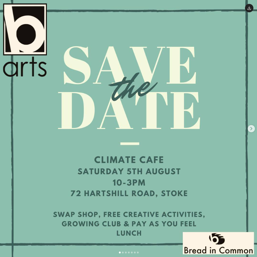
Learn from the examples of other organizations promoting climate emotions groups (e.g., cafes, circles, and so on)!
Climate Mental Health Network (https://www.instagram.com/climatementalhealth/)
Climate Psychology Alliance of North America (https://www.instagram.com/climatepsychologyalliancena/)
Climate Psychology Alliance (https://www.instagram.com/climate.psychology.alliance/)
Climate Cafe Victoria (https://www.instagram.com/victoriaclimatecafe/)
Force of Nature (https://www.instagram.com/forceofnature.xyz/)
Tips for your advertisement
Use a compelling headline that clearly states the event’s main attraction. Keep it short and impactful.
Use vibrant high-quality images or graphics that are visually appealing and relevant to the event. Bright colors tend to attract more attention.
Include essential information like the date, time, and location (or contact information about how to join). Consider using icons or small graphics to depict this information clearly.
Mention key benefits of attending the event, such as guest speakers, entertainment, or exclusive offers.
Design the ad to look good on mobile devices since most social media users access platforms via smartphones.
Use limited text and rely on visuals to convey the message; too much text can overwhelm the viewer.